The running demo needs a desktop screen.
Portfolio & Options Risk Charts for IBKR
Account Exposure
PnL by account
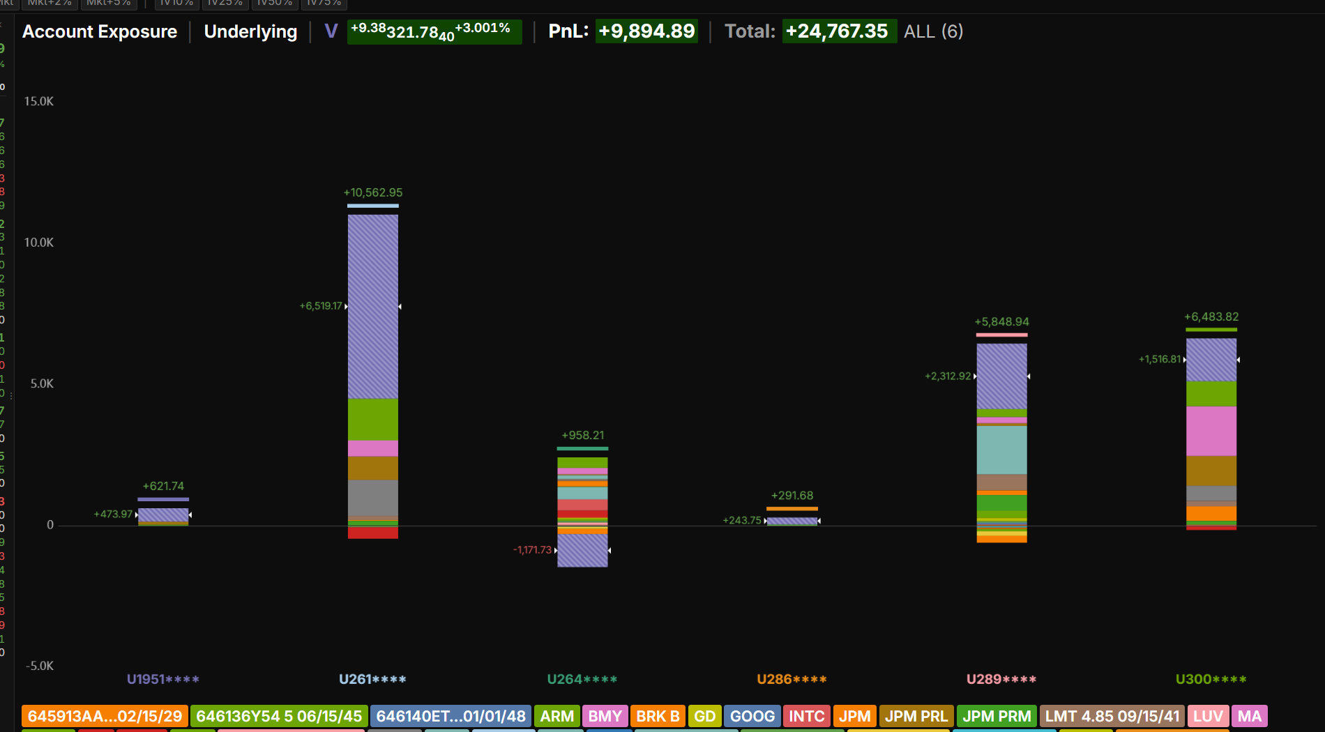
Which accounts are winners and which are losers? This chart simplifies all the noise in tables of position data, and shows which symbols are responsible. Each bar is one account, and each colored segment inside a bar is one underlying, sized by the selected metric (PnL in image). The metric can be PnL, theta, gamma, vega or about 100 others, and the chart can be filtered to a subset of positions by underlying, type, side, expiration or tag. Price and volatility scenarios show how the accounts would behave.
Delta Profile
PnL by delta
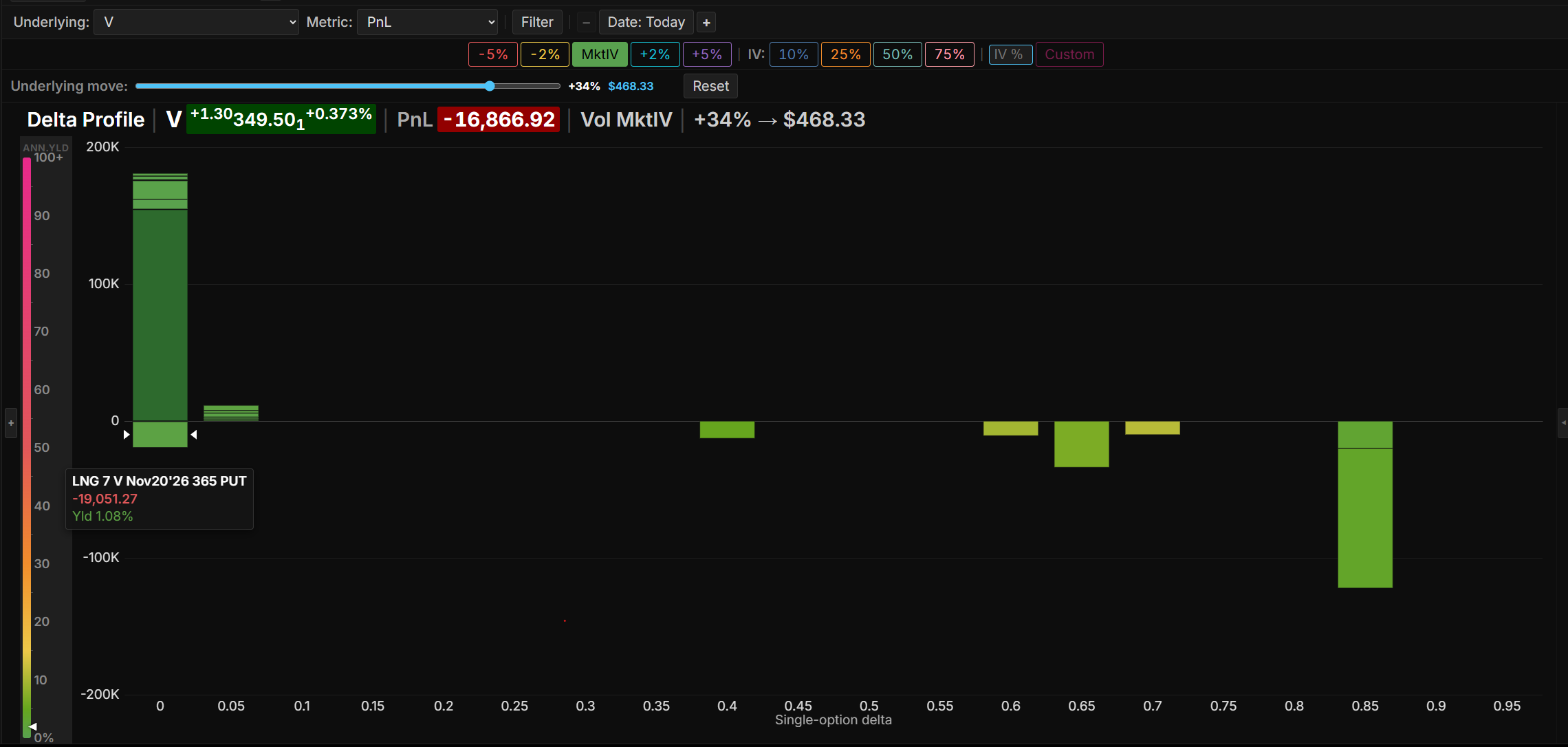
Where is the risk of exercise concentrated, and how does it move when the market moves? Delta measures moneyness, and it approximates the chance the option is exercised. For a single underlying, each bar is one bucket of single-option delta, from 0 to 1. Each segment inside a bar is one position, sized by the selected metric (PnL in image), and colored by the annualized yield of extrinsic value over strike, by delta, or by account. Changing volatility, date and price moves positions between buckets as their delta changes.
Expiry Exposure
PnL by expiration
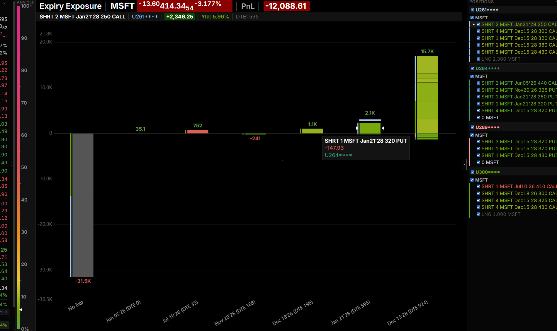
How much does each expiration contribute to PnL, theta, vega and delta? For one underlying or several, each bar is one expiration, and each segment inside a bar is one position at that expiration, sized by the selected metric (PnL in image). Segments are colored by the annualized yield of extrinsic value over strike, by delta, or by underlying. By changing volatility and the price of each underlying, you can model how the values change.
Expiry Profile
PnL by expiration, for the total, calls and puts
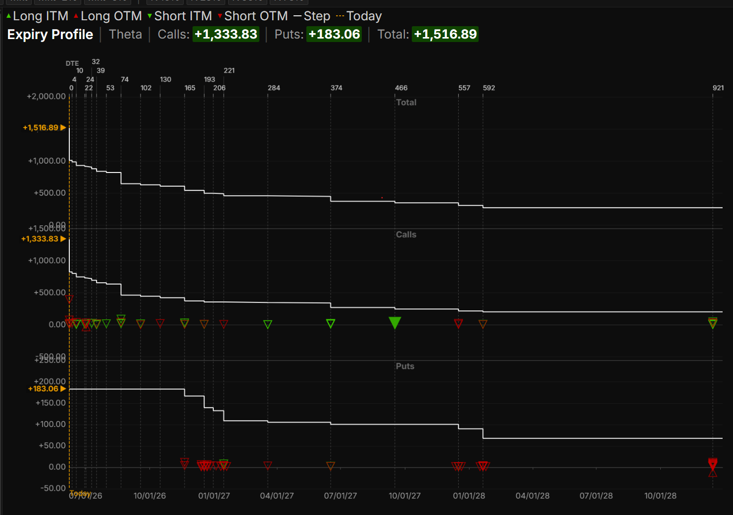
Which expirations contribute the most to PnL, theta or vega? Is the risk concentrated in any expiration? Three step charts show the selected metric (PnL in image) by expiration date: one for the total, one for calls and one for puts. Each position is plotted as a symbol indicating short or long and in or out of the money. By changing volatility and the price of each underlying, you can model how the values change.
Portfolio PnL
Net Liquidation and PnL through the trading day

How do Net Liquidation and PnL change through the trading day? Shown are Net Liquidation and PnL for selected accounts, with the top chart showing the total of the individual accounts. Below, each account has a row with its own Net Liquidation and PnL chart. The time window is set with the buttons above the charts, from one minute to twenty-four hours. The charts support zooming and panning.
Position Exposure
PnL by position, grouped by account
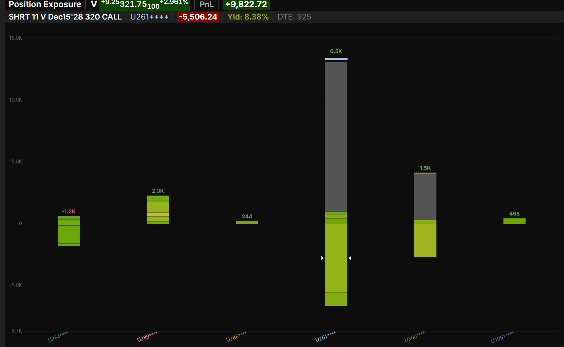
How is an underlying's PnL, theta, vega, delta and other metrics distributed among the accounts? Is the risk additive, or is one account a hedge against the others? Each bar is one account, and each segment inside a bar is one position in that account, sized by the selected metric (PnL in image). Segments are colored by the annualized yield of extrinsic value over strike, by delta, or by underlying. The Histogram button regroups the same positions into buckets of annualized yield or delta. By changing volatility and price you can model how the positions would behave.
Underlying Exposure
PnL by underlying
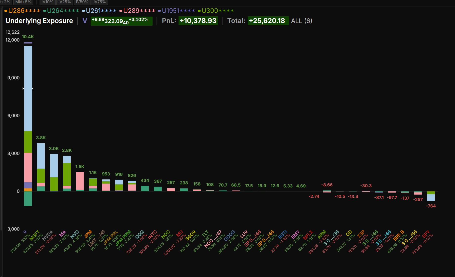
Which underlyings are winners and which are losers? This chart simplifies all the noise in tables of position data, and shows which accounts hold them. Each bar is one underlying, and each segment inside a bar is one position, sized by the selected metric (PnL in image). Segments are colored by the annualized yield of extrinsic value over strike, by delta, or by account. A base-currency button includes positions held in other currencies, converted to the base currency. Price and volatility scenarios show how each underlying would behave.
Underlying PnL
PnL and price for each underlying
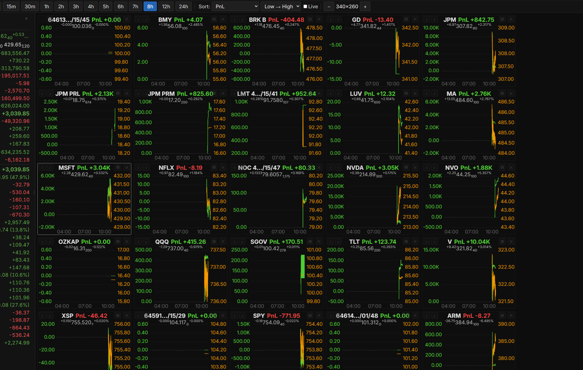
How does the PnL change with its underlying's price? The Underlying PnL view plots both over time, so you see where they move together and where they do not. A chart is plotted for each underlying held in the selected accounts, and its PnL is the total for those accounts. Any chart can be maximized, and zooming and panning are supported.
Vol Scenario
PnL for a range of prices, volatilities and dates
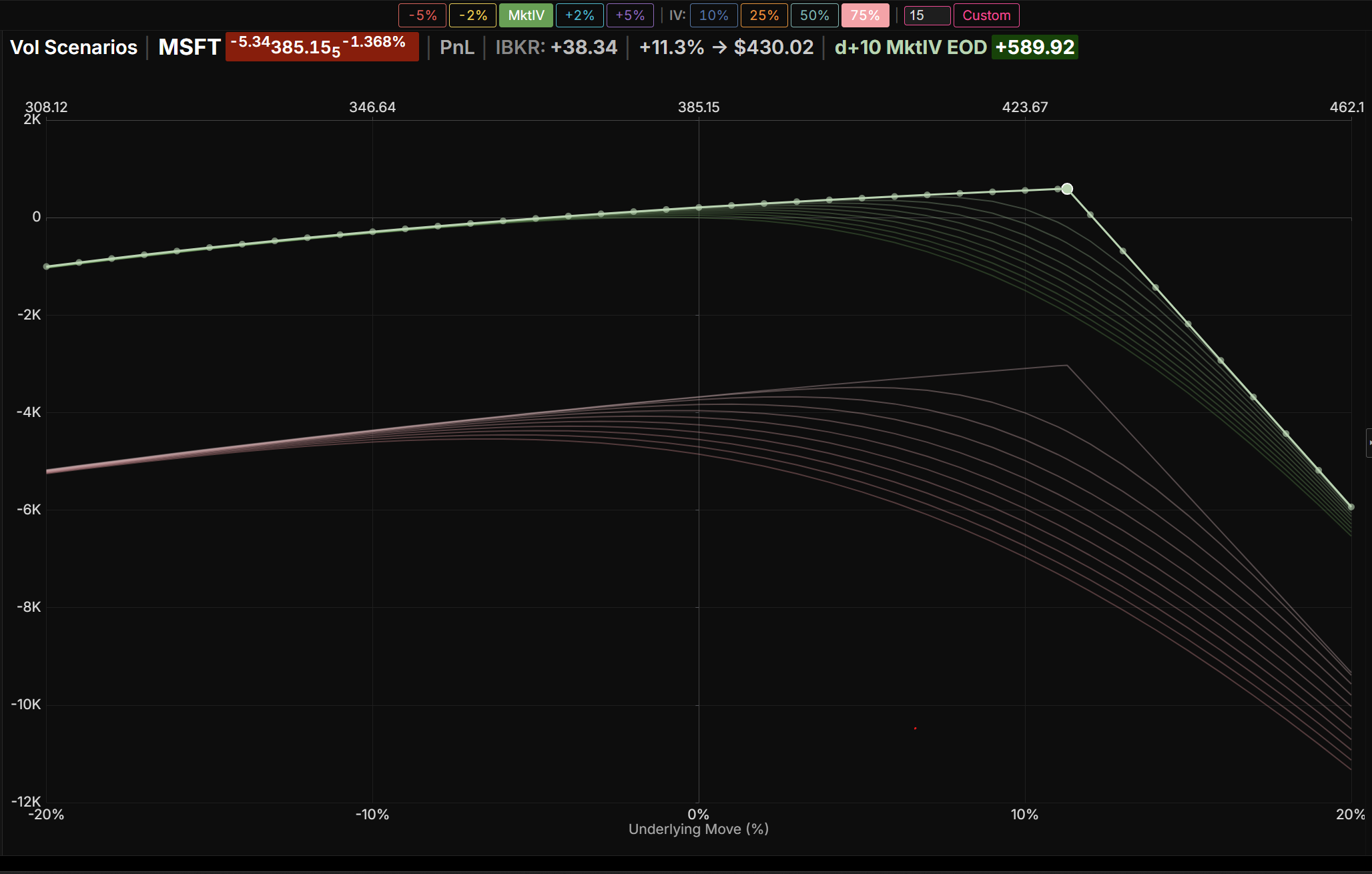
How does PnL, delta, theta, gamma or vega change with underlying price? When volatility spikes, what does the PnL look like, and will you be surprised? The Vol Scenario chart shows how a metric changes as the underlying price moves, with one curve for each volatility level. Custom mode adds future dates, and draws one curve for each date and volatility pair.
Vol Sweep
PnL for a range of volatilities, at several dates and price moves
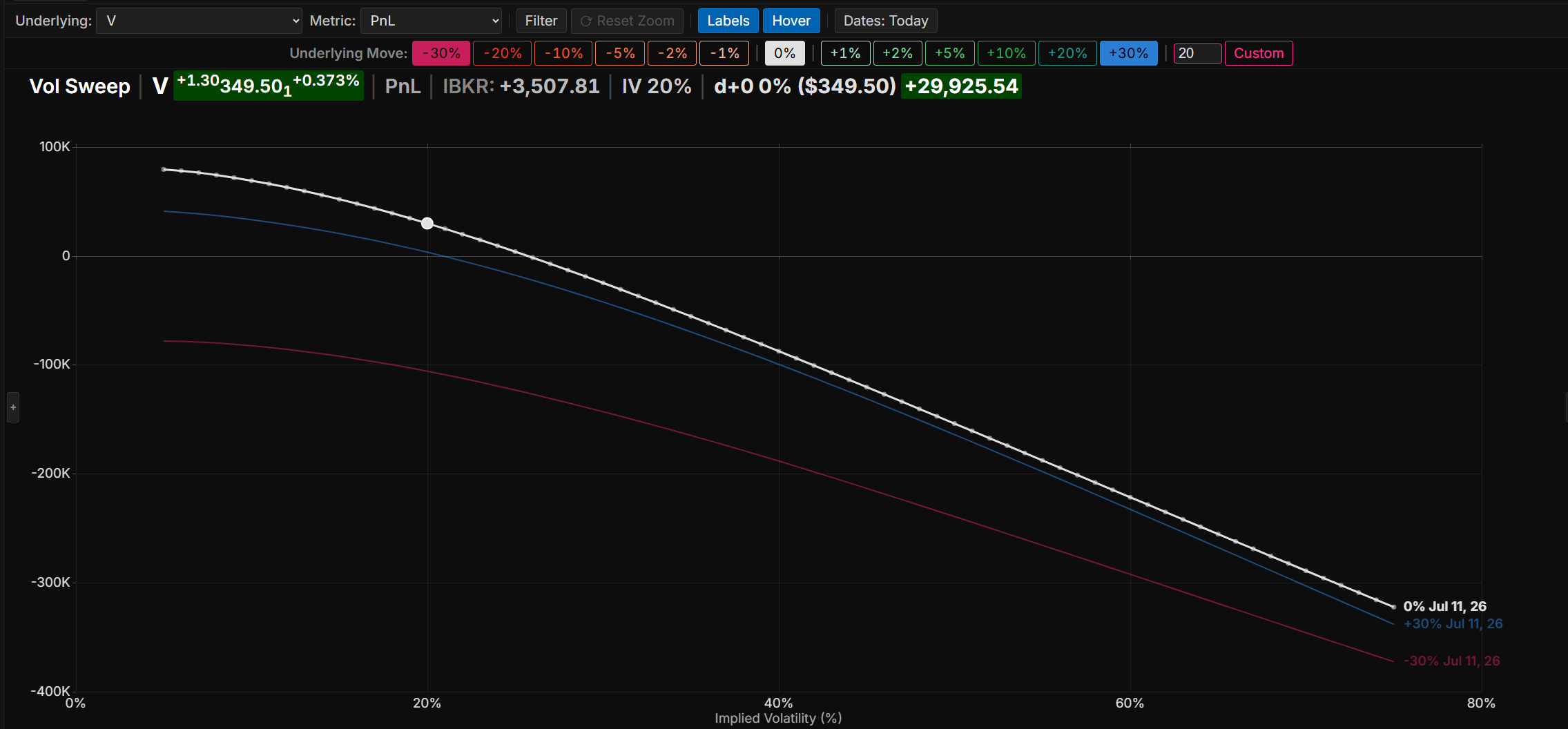
How does an underlying's PnL, theta or vega change under different volatilities? To what degree will a vol spike affect the PnL? The Vol Sweep chart shows how a metric changes as implied volatility is swept across a range, for a single underlying. One curve is drawn for each combination of price move and date selected, so the response can be compared at several price levels and dates.